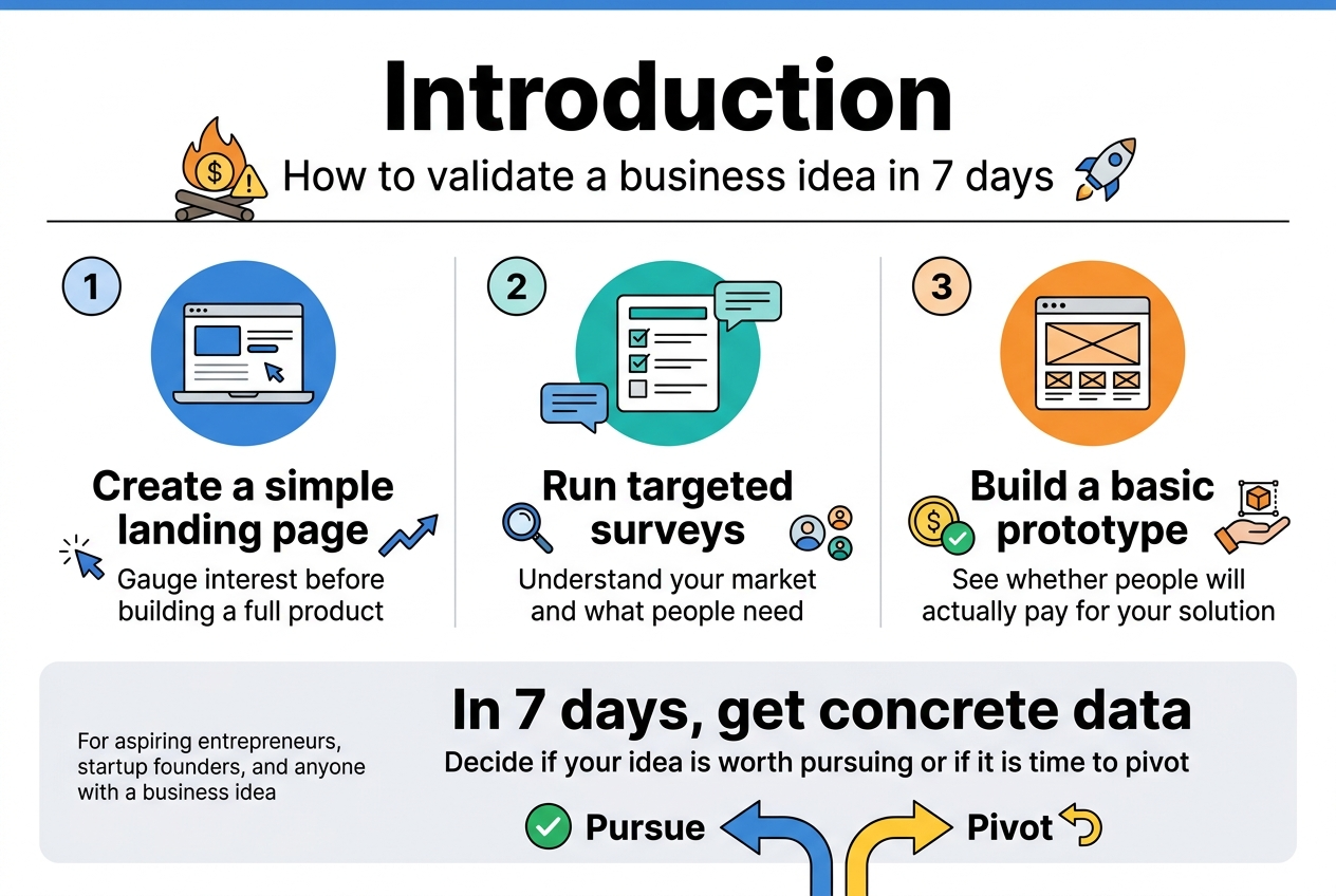
Starting a business without knowing if anyone actually wants what you’re selling is like throwing money into a fire pit. How to validate a business idea in 7 days can save you months of wasted effort and thousands of dollars before you fully commit to launching.
This step-by-step guide is for aspiring entrepreneurs, startup founders, and anyone with a business idea who wants to test the waters quickly and cheaply. You’ll learn exactly how to prove your concept has real potential without building a full product or quitting your day job.
We’ll walk through creating a simple landing page to gauge interest, running targeted surveys to understand your market, and building a basic prototype that shows whether people will actually pay for your solution. By the end of one week, you’ll have concrete data to decide if your idea is worth pursuing or if it’s time to pivot to something better.
Define Your Business Idea and Target Market
![Create a clean, modern business infographic in a 3:2 landscape aspect ratio with a full-bleed layout, no outer frame, no inset margins, and a wide horizontal composition. Use a professional color palette of deep navy, teal, blue, white, and warm accent orange. Use bold sans-serif typography with strong hierarchy. Place a large title across the top:
"Define Your Business Idea and Target Market"
Below the title, arrange three wide horizontal sections across the page, each in a clean card with an icon and numbered heading.
SECTION 1 on the left: a light blue card with a speech bubble and lightbulb icon. Heading text:
"1. Value Proposition"
Subheading text:
"Clearly articulate your business in one sentence"
Include a formula callout in a highlighted box:
"We help [target customer] achieve [desired outcome] by [unique method or solution]."
Add a sample sentence in a smaller accent box:
"We help busy working parents save 2+ hours weekly on meal planning by delivering personalized, grocery-store-ready shopping lists based on their family's preferences."
Add three small checklist bullets with check icons:
"Who you serve"
"What problem you solve"
"Why it matters"
Add a small test badge with a question mark icon:
"Mom test: Is it instantly clear?"
SECTION 2 in the center: a teal card with a person silhouette, location pin, and chart icons. Heading text:
"2. Ideal Customer Persona"
Subheading text:
"Define who your customer is and how they behave"
Split this card into two columns with mini labels:
Left column heading:
"Demographics"
Bullets:
"Age range"
"Income level"
"Geographic location"
"Job title or industry"
"Education level"
"Family status"
Right column heading:
"Psychographics & Behaviors"
Bullets:
"What keeps them awake at 3 AM?"
"Where do they get information?"
"What platforms do they actually use?"
"What brands do they love?"
"How do they solve the problem now?"
At the bottom of this section add a small group-of-people icon and text:
"Create](https://gravitywrite.sgp1.digitaloceanspaces.com/blog/img_4403341_2026_04_22_12_46_49.jpg)
Clearly articulate your value proposition in one sentence
Your value proposition is the North Star that guides your entire business validation process. Start by crafting a single, compelling sentence that captures exactly what your business does, who it serves, and why it matters. This isn’t about creating marketing copy – it’s about forcing clarity in your own thinking.
A strong value proposition follows a simple formula: “We help [target customer] achieve [desired outcome] by [unique method or solution].” For example, “We help busy working parents save 2+ hours weekly on meal planning by delivering personalized, grocery-store-ready shopping lists based on their family’s preferences.”
Test your value proposition with the “mom test” – can your mother or neighbor immediately understand what you do without asking follow-up questions? If they’re confused or need clarification, your statement needs work. The best value propositions make people say “I need that” or “I know someone who needs that.”
Write down five different versions of your value proposition. Read each one aloud and pick the version that feels most natural and creates the strongest immediate reaction. This sentence will become your testing tool throughout the validation week – every survey question, landing page headline, and customer conversation should tie back to this core promise.
Identify your ideal customer persona and demographics
Creating a detailed customer persona isn’t academic busy work – it’s the foundation for every validation activity you’ll conduct. Your ideal customer should be specific enough that you could walk into a coffee shop and spot them in the crowd.
Start with demographics, but don’t stop there. Demographics tell you where to find your customers, but psychographics tell you how to talk to them. Consider these key elements:
Demographics:
- Age range (be specific: 28-35, not “millennials”)
- Income level and spending habits
- Geographic location
- Job title or industry
- Education level
- Family status
Psychographics and Behaviors:
- What keeps them awake at 3 AM worrying?
- Where do they get information and make purchasing decisions?
- What social media platforms do they actually use (not just have accounts on)?
- What brands do they love and why?
- How do they currently solve the problem your business addresses?
Create 2-3 different customer personas if your business serves multiple segments. Give each persona a name and find a stock photo that represents them. This makes them feel real and helps you make better decisions throughout your validation process.
The goal is to become so familiar with your ideal customer that you can predict their reactions and concerns before you even start testing your idea.
Map out the specific problem your idea solves
Problem definition separates successful businesses from failed ones. You need to identify not just any problem, but a problem that’s painful enough that people will pay to solve it. This means digging deeper than surface-level frustrations.
Start by categorizing the problem your business addresses:
Problem Severity Levels:
- Hair on fire problems: Urgent, painful issues people will pay premium prices to solve immediately
- Vitamin problems: Nice-to-have improvements that people might pay for when convenient
- Painkiller problems: Ongoing frustrations that people actively seek solutions for
Document the problem from multiple angles. How does this problem show up in your customer’s daily life? What does it cost them in time, money, stress, or missed opportunities? What have they already tried to solve it, and why didn’t those solutions work?
Create a problem statement that passes the “so what” test. For each aspect of the problem you identify, ask “so what?” until you reach the real impact. For example: “People forget to water their plants” → “So what?” → “Plants die” → “So what?” → “They waste money and feel guilty about killing living things” → “So what?” → “They avoid buying plants altogether, missing out on the mental health benefits of indoor greenery.”
The problems worth solving are the ones where people say “Yes! That’s exactly my situation” when you describe it back to them.
Conduct Quick Market Research and Competitor Analysis
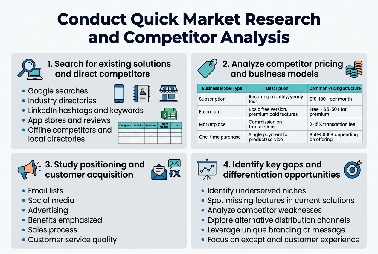
Search for existing solutions and direct competitors
Start your market research with a comprehensive competitor search across multiple channels. Use Google to search for businesses offering similar products or services using various keyword combinations related to your idea. Don’t limit yourself to obvious competitors – look for alternative solutions that address the same customer pain point.
Check industry-specific directories, professional associations, and trade publications in your sector. LinkedIn can be incredibly valuable for finding companies and professionals in your space. Search for relevant hashtags and keywords to discover businesses you might have missed through traditional search methods.
Explore app stores if your idea involves mobile or software solutions. Browse through categories related to your concept and examine both direct competitors and adjacent solutions. Pay attention to user reviews and ratings – they reveal crucial insights about what customers love and hate about existing options.
Don’t forget about offline competitors. Visit local businesses, attend trade shows, and check yellow pages or local business directories. Sometimes the most significant competition comes from traditional businesses that haven’t established a strong online presence.
Create a simple spreadsheet to track your findings. Include company names, websites, key features, target markets, and any unique selling propositions you notice. This organized approach helps you spot patterns and gaps in the market that your business idea could potentially fill.
Analyze competitor pricing and business models
Dive deep into how your competitors make money and structure their pricing. Visit their websites, sign up for free trials, and examine their pricing pages carefully. Look for different pricing tiers, subscription models, one-time fees, or commission-based structures.
| Business Model Type | Description | Common Pricing Structure |
|---|---|---|
| Subscription | Recurring monthly/yearly fees | $10-100+ per month |
| Freemium | Basic free version, premium paid features | Free + $5-50+ for premium |
| Marketplace | Commission on transactions | 2-15% transaction fee |
| One-time purchase | Single payment for product/service | $50-5000+ depending on offering |
Study their customer acquisition strategies by signing up for their email lists, following their social media, and observing their advertising. Notice how they position themselves and what benefits they emphasize. This reveals what customers value most in your market.
Reach out to competitors as a potential customer to understand their sales process, customer service quality, and overall user experience. Document response times, professionalism, and how well they address customer concerns.
Look beyond direct competitors to examine successful businesses in adjacent markets. They might use innovative pricing models or business approaches that could work in your space. For example, if you’re launching a food delivery service, study how ride-sharing companies structure their pricing and operations.
Calculate the average pricing ranges you discover and identify any premium or budget positioning opportunities that seem underserved in the market.
Create a Simple Landing Page to Test Interest
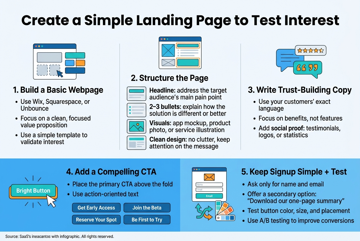
Build a Basic Webpage Describing Your Solution
Creating a landing page doesn’t require advanced technical skills or a massive budget. Your goal is to build something clean and focused that clearly communicates your business idea’s value proposition. Start with website builders like Wix, Squarespace, or Unbounce, which offer drag-and-drop templates perfect for validation testing.
Your landing page should follow a simple structure that guides visitors naturally toward understanding your solution. Begin with a compelling headline that immediately addresses your target audience’s main pain point. Follow this with 2-3 bullet points explaining how your solution solves their problem differently or better than existing options.
Include visual elements that help visitors grasp your concept quickly. This might be a mockup of your app interface, photos of your physical product, or simple illustrations showing your service in action. Keep the design clean and uncluttered – you want people focusing on your message, not getting distracted by fancy graphics.
Write copy in your customers’ language, using the exact words and phrases they use when describing their problems. This research from your market analysis pays off here. Avoid industry jargon and focus on benefits rather than features. Instead of saying “Our platform leverages advanced algorithms,” try “Get personalized recommendations that actually match your style.”
Add social proof elements like customer testimonials, logos of companies you’ve worked with, or statistics that build credibility. Even if you’re just starting out, you can include quotes from your initial interviews or surveys that validate the problem you’re solving.
Include a Compelling Call-to-Action for Early Sign-ups
Your call-to-action (CTA) is the most critical element of your landing page. This button or form determines whether visitors simply browse and leave or take the next step in your validation process. Make your CTA specific and action-oriented rather than generic.
Instead of boring phrases like “Sign Up” or “Learn More,” use language that creates urgency and value. Try options like “Get Early Access,” “Join the Beta,” “Reserve Your Spot,” or “Be First to Try.” These phrases suggest exclusivity and make people feel like they’re getting something special.
Position your primary CTA above the fold where visitors see it immediately, but don’t stop there. Include secondary CTAs throughout your page, especially after you’ve explained key benefits. Some visitors need more information before they’re ready to commit.
Consider offering multiple levels of engagement to capture different types of interest. Your main CTA might ask for email addresses to join a beta list, while a secondary option could be “Download our one-page summary” for people who aren’t ready for full commitment yet.
Make your signup form as simple as possible. Ask only for essential information – typically just name and email address. Every additional field you add will reduce your conversion rate. You can always gather more details later once people have shown genuine interest.
Test different CTA button colors, sizes, and placement to see what works best with your audience. A/B testing tools built into most landing page platforms make this straightforward, even for non-technical founders.
Run Targeted Social Media and Online Surveys
![Create a clean professional full-bleed infographic in a 3:2 aspect ratio with a modern flat vector style, white background, blue and teal accent colors, dark navy text, and orange highlights. Use a wide horizontal layout with two main columns and clear section blocks, not a narrow centered stack.
Top header across full width:
Large bold title text: "Run Targeted Social Media and Online Surveys"
Subheading in smaller text: "Launch quick polls and detailed surveys to validate your business idea"
Left column section 1 with a speech-bubble and poll icon:
Heading: "1. Launch polls on relevant social platforms and forums"
Add 5 small platform icons with labels in a neat horizontal row:
"LinkedIn" "Instagram" "TikTok" "Facebook Groups" "Reddit"
Below, a checklist-style block with short lines and icons:
• "Ask specific, actionable questions"
• "Example: 'What's your biggest challenge when [describe the problem your product solves]'?"
• "Follow up with: 'Which feature would matter most to you?'"
• "Use 3-4 clear answer choices"
• "Twitter polls work well with hashtags"
• "Post during peak hours: 9-10 AM and 7-9 PM"
• "Engage in comments and ask follow-up questions"
Include small icons for clock, hashtag, chat bubbles, and forum/community symbols.
Right column section 2 with a clipboard and survey form icon:
Heading: "2. Create detailed surveys for your target audience"
Add a vertical flow with 4 connected steps using numbered circles:
"Screening questions"
"Problem identification"
"Solution preferences"
"Pricing sensitivity"
Below, a compact tool row with app-style icons and labels:
"Typeform" "SurveyMonkey" "Google Forms"
Add a small question-type legend with icons:
"Multiple choice" "Rating scales" "Open-ended questions"
Add a quote-style callout box with the exact text:
"Replace 'How much would you pay for a time-saving productivity app?' with 'What do you currently spend monthly on productivity tools?'"
Add another short block with icons:
"Distribute through email lists, social media, Facebook groups, and industry newsletters"
"Offer small incentives like discount codes or free resources"
"Target 100-200 responses"](https://gravitywrite.sgp1.digitaloceanspaces.com/blog/img_4403341_2026_04_22_12_50_20.jpg)
Launch polls on relevant social platforms and forums
Social media polls offer an instant pulse check on your business idea without requiring significant investment or time. Start by identifying where your target audience spends their time online. LinkedIn works best for B2B concepts, while Instagram and TikTok excel for consumer products targeting younger demographics. Facebook groups remain goldmines for niche communities, and Reddit provides brutally honest feedback across countless specialized subreddits.
Create polls that ask specific, actionable questions about your business concept. Instead of asking “Would you buy this product?” try “What’s your biggest challenge when [describe the problem your product solves]?” This approach reveals pain points without leading respondents toward predetermined answers. Follow up with option-based questions like “Which feature would matter most to you?” accompanied by 3-4 clear choices.
Twitter polls work exceptionally well for quick validation, especially when combined with relevant hashtags. Post during peak hours when your audience is most active, typically between 9-10 AM and 7-9 PM in their local time zones. Don’t forget industry-specific forums like ProductHunt, AngelList, or specialized communities related to your business sector.
Engage actively with poll respondents by asking follow-up questions in comments. This deeper conversation often reveals insights more valuable than the poll results themselves. People who take time to explain their votes are potential early adopters worth connecting with directly.
Create detailed surveys for your target audience
While polls provide quick snapshots, detailed surveys dig deeper into customer motivations, preferences, and buying behaviors. Design surveys that take 5-7 minutes to complete – any longer and response rates plummet. Start with screening questions to ensure respondents match your target demographic, then progress through problem identification, solution preferences, and pricing sensitivity.
Use tools like Typeform, SurveyMonkey, or Google Forms to create professional-looking surveys. Mix question types strategically: multiple choice for quantifiable data, rating scales for preference intensity, and open-ended questions for qualitative insights. The magic happens in those text responses where people explain their reasoning.
Craft questions that avoid leading respondents toward desired answers. Replace “How much would you pay for a time-saving productivity app?” with “What do you currently spend monthly on productivity tools?” This approach uncovers real spending patterns rather than hypothetical commitments.
Distribute surveys through multiple channels to reach diverse audience segments. Email lists, social media posts, relevant Facebook groups, and industry newsletters all serve as distribution points. Offer small incentives like discount codes or free resources to boost response rates, but keep rewards modest to avoid attracting people only interested in freebies.
Target 100-200 responses for statistically meaningful data. Quality trumps quantity – 50 responses from your exact target market provide more value than 500 responses from random people. Track completion rates and adjust survey length if people abandon midway through.
Develop and Test a Minimum Viable Product Prototype
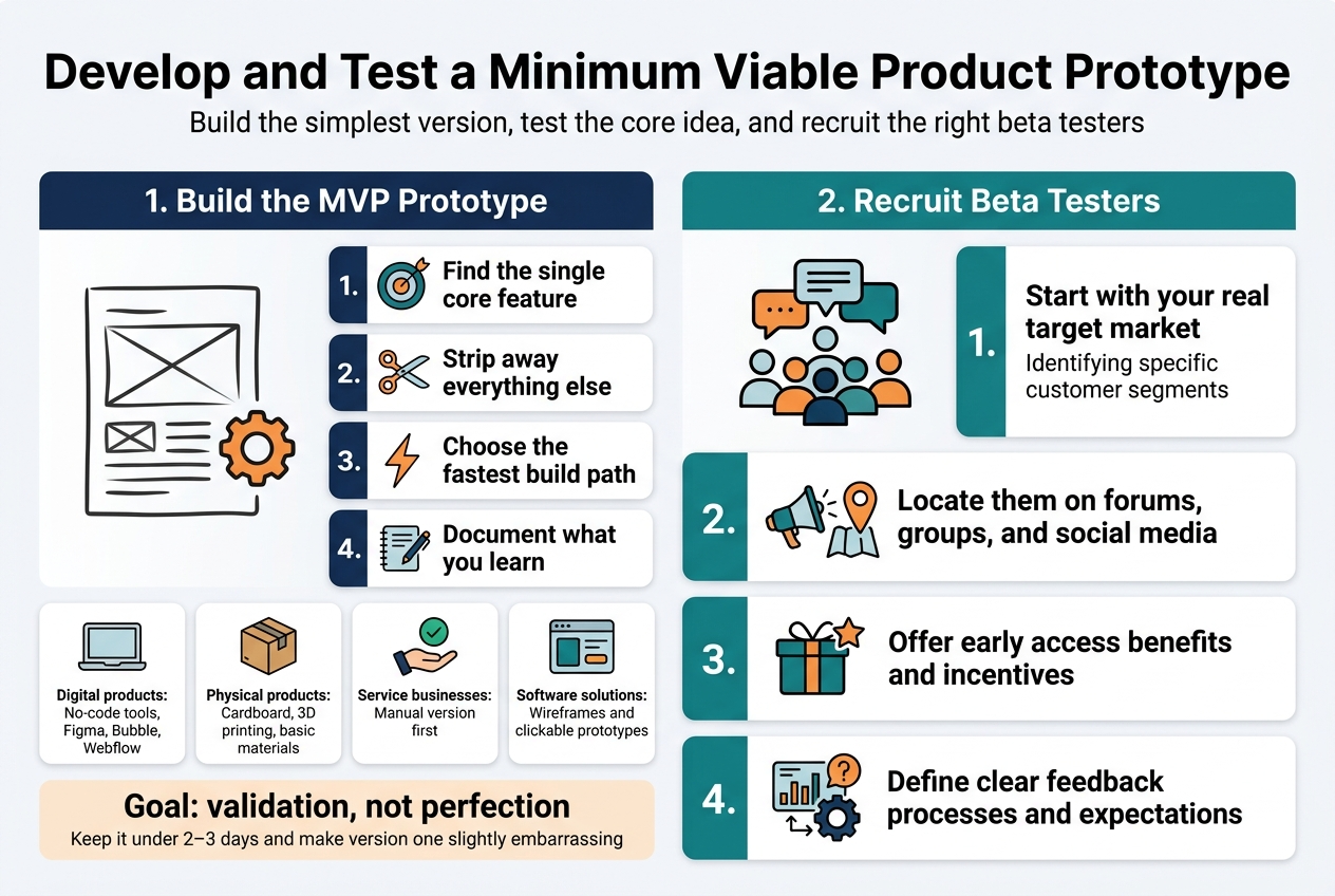
Create a basic version of your product or service
Building your minimum viable product (MVP) doesn’t mean creating a fully-featured masterpiece. Think of it as your business idea’s first rough sketch – functional enough to test core assumptions but simple enough to build quickly.
Start by identifying the single most important feature that solves your target customer’s primary problem. Strip away everything else. If you’re developing a meal planning app, focus solely on the recipe storage feature. Save the grocery list integration and social sharing for later versions.
Choose the fastest path to creation based on your skills and resources:
- Digital products: Use no-code tools like Bubble, Webflow, or Figma for interactive prototypes
- Physical products: Create mockups using cardboard, 3D printing, or basic materials
- Service-based businesses: Offer a simplified version manually before automating
- Software solutions: Build wireframes or clickable prototypes using tools like InVision or Marvel
Your MVP should answer one critical question: “Will people actually use this?” Keep development time under 2-3 days maximum. Remember, you’re not building the final product – you’re testing whether your core concept resonates with real users.
Document everything during this process. Note which features feel essential versus nice-to-have. Track how long each element takes to build. This information becomes invaluable when planning your full product roadmap.
The goal isn’t perfection; it’s validation. Your MVP should feel slightly embarrassing when you show it to others. If you’re completely proud of version one, you’ve probably over-engineered it.
Recruit beta testers from your network and online communities
Finding the right beta testers can make or break your validation process. You need people who represent your actual target market, not just friends who’ll tell you what you want to hear.
Start with your existing network, but be strategic about it. Reach out to people who genuinely experience the problem you’re solving. If you’re building a tool for freelancers, contact the independent contractors in your LinkedIn connections. Avoid asking family members unless they’re part of your target demographic.
Leverage online communities where your potential customers already gather:
| Platform Type | Examples | Best For |
|---|---|---|
| r/entrepreneur, r/startups, niche subreddits | Honest feedback, diverse perspectives | |
| Facebook Groups | Industry-specific groups | Targeted demographics |
| Discord Servers | Gaming, tech, creative communities | Real-time feedback sessions |
| Professional Networks | LinkedIn groups, Slack communities | B2B products and services |
When recruiting, be transparent about what you’re building and what you need from testers. Offer something valuable in return – early access to the full product, a discount, or even a small payment for their time.
Create a simple application process asking about their current challenges, existing solutions they use, and availability for feedback sessions. This helps you select testers who match your ideal customer profile.
Aim for 5-10 beta testers maximum. More than that becomes difficult to manage in a week-long validation sprint. Quality beats quantity – better to have five engaged testers who provide detailed feedback than twenty who barely engage with your prototype.
Set clear expectations upfront about the testing timeline, what kind of feedback you’re seeking, and how they can reach you with questions or concerns.
Measure Key Validation Metrics and Customer Demand
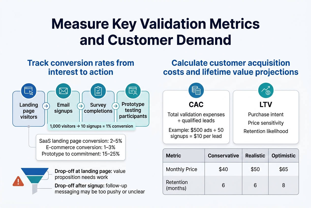
Track conversion rates from interest to action
Conversion rates tell the real story of how compelling your business idea actually is. Start by setting up clear tracking for each stage of your validation funnel. Your landing page visitors, email signups, survey completions, and prototype testing participants all represent different levels of engagement.
Focus on measuring the progression from passive interest to active engagement. If 1,000 people visit your landing page but only 10 sign up for your email list, that’s a 1% conversion rate. While this might seem low, industry benchmarks vary dramatically. SaaS companies typically see 2-5% landing page conversion rates, while e-commerce can range from 1-3%.
Track these key conversion points:
- Landing page to email signup: Measures initial interest level
- Email subscriber to survey completion: Shows willingness to engage deeper
- Survey completion to prototype testing: Indicates serious purchase consideration
- Prototype testing to pre-order/commitment: Reveals genuine buying intent
Use Google Analytics, Hotjar, or simple spreadsheet tracking to monitor these numbers daily. Set up conversion funnels that show exactly where people drop off. If you’re losing most visitors at the landing page stage, your value proposition needs work. If people sign up but won’t complete surveys, your follow-up messaging might be too pushy or unclear.
Pay special attention to your prototype-to-commitment conversion rate. This number directly predicts your potential success. Strong validation typically shows 15-25% of prototype testers expressing genuine purchase intent.
Calculate customer acquisition costs and lifetime value projections
Customer acquisition cost (CAC) and lifetime value (LTV) calculations during validation help you understand the economic viability of your business model before you invest heavily in marketing and operations.
Calculate your preliminary CAC by dividing your total validation expenses by the number of qualified leads generated. Include costs for social media ads, survey tools, landing page hosting, and any promotional materials. If you spent $500 on Facebook ads and generated 50 email signups, your current CAC is $10 per lead.
For LTV projections during validation, gather data from your surveys and prototype testing about:
- Purchase intent and frequency: How often would customers buy your product?
- Price sensitivity: What’s the maximum they’d pay? What’s their preferred price point?
- Retention likelihood: How long would they continue using your solution?
Create conservative, realistic, and optimistic LTV scenarios based on this data. If your prototype testing shows people would pay $50 monthly for your service and keep it for an average of 8 months, your projected LTV is $400.
| Metric | Conservative | Realistic | Optimistic |
|---|---|---|---|
| Monthly Price | $40 | $50 | $65 |
| Retention (months) | 6 | 8 | 12 |
| LTV | $240 | $400 | $780 |
Your LTV should be at least 3-5 times higher than your CAC for a sustainable business model. If your validation shows a CAC of $10 and projected LTV of $400, you’re looking at a 40:1 ratio, which indicates strong potential profitability.
Make Data-Driven Decisions About Your Business Idea
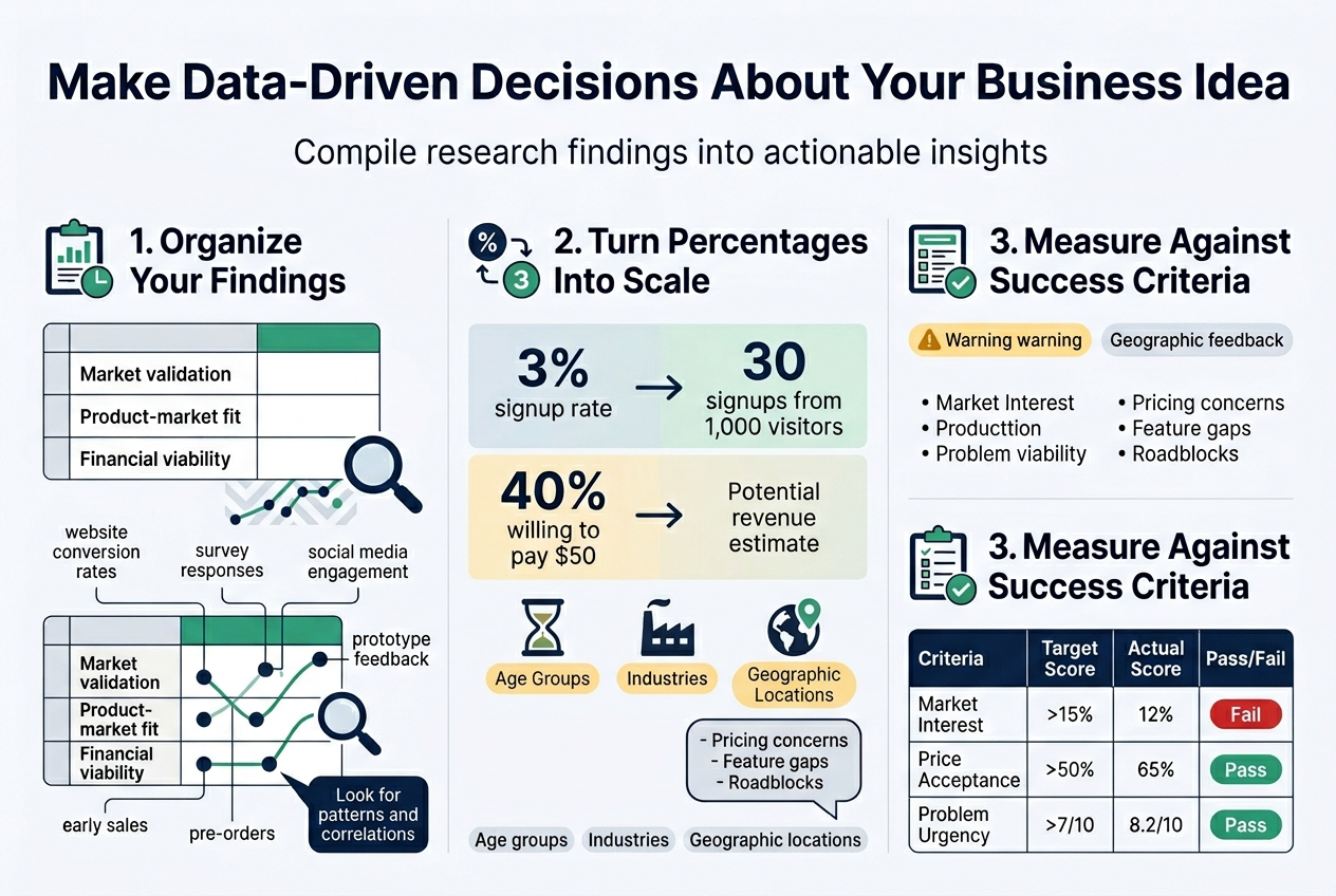
Compile all research findings and metrics into actionable insights
After six days of intense validation activities, you’ve gathered a mountain of data. Now comes the critical moment where you transform raw information into clear, actionable insights that will shape your business future.
Start by organizing your findings into three main categories: market validation, product-market fit, and financial viability. Create a simple spreadsheet or document where you can visualize all your metrics side by side. This includes website conversion rates, survey responses, social media engagement, prototype feedback, and any early sales or pre-orders you’ve captured.
Look for patterns and correlations across your different validation methods. Did the enthusiasm from your landing page visitors match the feedback from your prototype testing? Are there consistent pain points mentioned across surveys and interviews? Pay special attention to demographic data – certain age groups, industries, or geographic locations might show stronger interest than others.
Convert percentages into real numbers to better understand scale. If 3% of your landing page visitors signed up for updates, calculate what that means for different traffic volumes. If 40% of survey respondents said they’d pay $50 for your solution, estimate the potential revenue based on your target market size.
Document both positive and negative feedback patterns. Negative insights are just as valuable – they reveal potential roadblocks, pricing concerns, or feature gaps that could derail your business if ignored.
Determine if the idea meets your success criteria
Before you started this validation process, you should have defined what success looks like. Now it’s time to measure your findings against those benchmarks and make tough, honest decisions about your business idea’s future.
Create a simple scoring system for your key criteria. Common benchmarks include:
- Market demand: Did at least 10-15% of your target audience express genuine interest?
- Willingness to pay: Are people willing to pay your target price point?
- Problem severity: Do potential customers rate the problem you’re solving as urgent or important?
- Competitive advantage: Can you differentiate meaningfully from existing solutions?
- Personal fit: Do you have the skills, passion, and resources to execute this idea?
| Criteria | Target Score | Actual Score | Pass/Fail |
|---|---|---|---|
| Market Interest | >15% | 12% | Fail |
| Price Acceptance | >50% | 65% | Pass |
| Problem Urgency | >7/10 | 8.2/10 | Pass |
| Differentiation | Strong | Moderate | Borderline |
Be brutally honest about what the data tells you. If multiple validation methods show lukewarm interest, don’t rationalize the results away. Sometimes the best business decision is to pivot or abandon an idea that doesn’t meet your criteria.
Consider three possible outcomes: green light (proceed as planned), yellow light (pivot the concept), or red light (stop and try something else). A yellow light might mean adjusting your target market, changing your pricing strategy, or modifying core features based on feedback.
Remember that validation isn’t about proving you’re right – it’s about discovering the truth before you invest significant time and money. The goal is to fail fast and cheap if you’re going to fail at all.
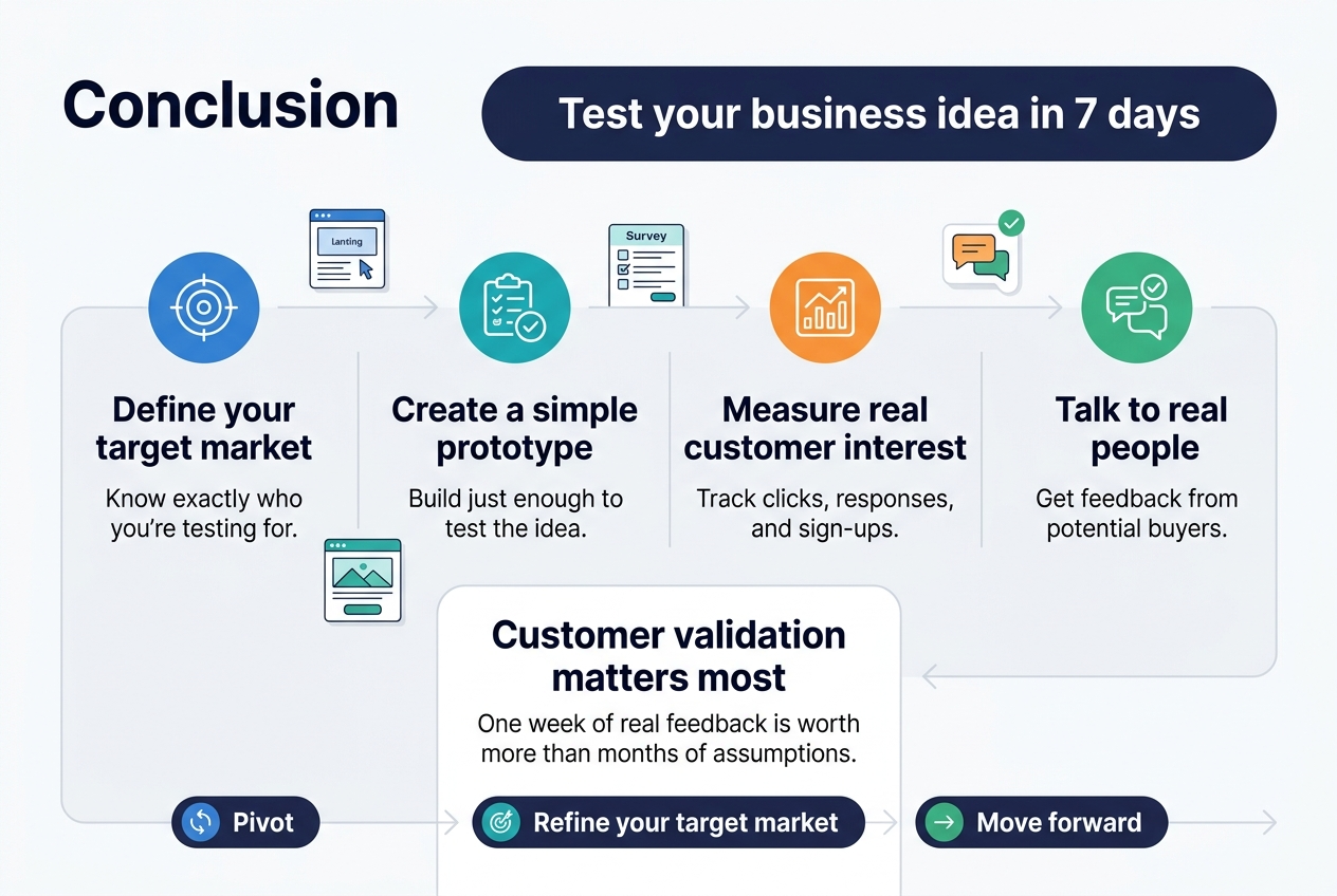
Testing your business idea doesn’t have to take months of planning and endless research. With this 7-day approach, you can quickly discover whether your concept has real potential before investing significant time and money. From defining your target market to creating a simple prototype and measuring actual customer interest, each step builds on the previous one to give you concrete data about your idea’s viability.
The key is moving fast and staying focused on what really matters – customer validation. Don’t get caught up in perfecting every detail or second-guessing yourself. Launch that landing page, send out those surveys, and talk to real people who might buy your product. The feedback you gather in just one week will be worth more than months of assumptions. Take action on what the data tells you, whether that means pivoting your approach, refining your target market, or confidently moving forward with your validated business idea.