Website owners struggling to turn traffic into meaningful revenue need proven ad monetization strategies that actually work. This guide is designed for bloggers, content creators, and site owners who want to maximize their earning potential without overwhelming their audience.
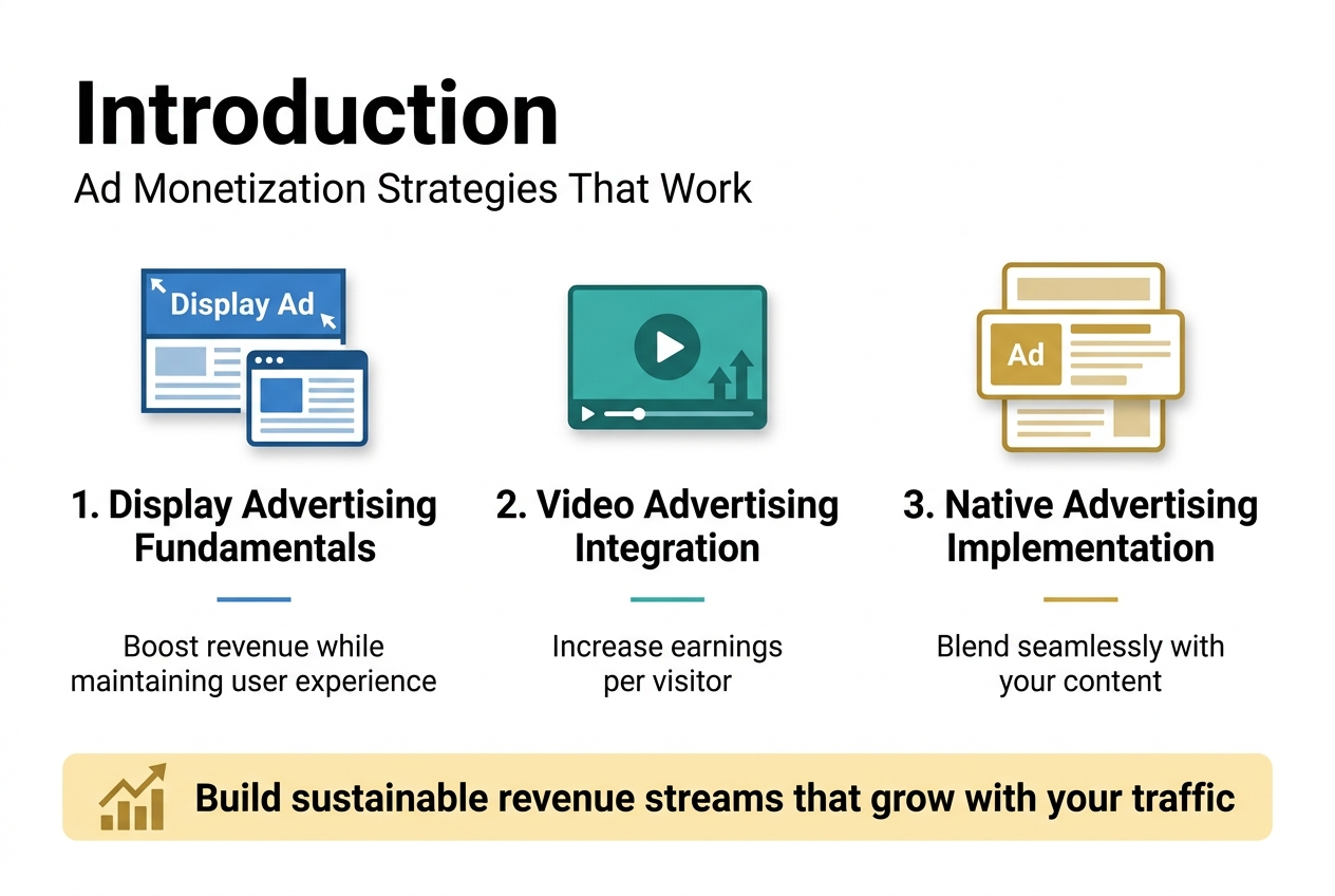
You’ll discover how to implement display advertising fundamentals that boost revenue while maintaining user experience. We’ll also explore video advertising integration techniques that can dramatically increase your earnings per visitor. Finally, you’ll learn native advertising implementation methods that blend seamlessly with your content and keep readers engaged while generating income.
These strategies will help you build sustainable revenue streams that grow alongside your website traffic.
Display Advertising Fundamentals for Maximum Revenue
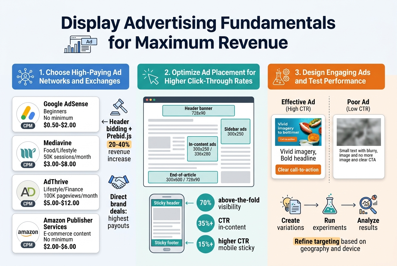
Choose High-Paying Ad Networks and Exchanges
Selecting the right ad network can make or break your revenue potential. Google AdSense remains the most accessible option for beginners, offering reliable payouts and easy integration. However, experienced publishers often find better rates with premium networks like Mediavine, AdThrive, or Ezoic, which typically require higher traffic thresholds but deliver significantly better CPMs.
Header bidding platforms have revolutionized ad revenue optimization by allowing multiple demand sources to compete for your ad inventory simultaneously. Prebid.js is the industry standard for implementing header bidding, enabling real-time auctions that drive up ad prices. Publishers using header bidding often see 20-40% revenue increases compared to traditional waterfall setups.
Consider diversifying across multiple ad exchanges to maximize competition for your inventory:
| Network Type | Best For | Minimum Requirements | Average CPM Range |
|---|---|---|---|
| Google AdSense | Beginners | No minimum | $0.50-$2.00 |
| Mediavine | Food/Lifestyle | 50K sessions/month | $3.00-$8.00 |
| AdThrive | Lifestyle/Finance | 100K pageviews/month | $5.00-$12.00 |
| Amazon Publisher Services | E-commerce content | No minimum | $2.00-$6.00 |
Direct advertising deals with brands in your niche often provide the highest payouts. Reach out to companies that align with your audience demographics and propose custom sponsorship packages that include display ads, sponsored content, and newsletter placements.
Optimize Ad Placement for Higher Click-Through Rates
Strategic ad placement dramatically impacts both user experience and revenue generation. The most profitable positions are typically above the fold, within content, and at the end of articles. However, aggressive ad placement can harm user engagement and search engine rankings.
Heat mapping studies consistently show that ads perform best when integrated naturally into content flow. Place your highest-value ad units in these prime locations:
- Header banner: 728×90 leaderboard ads work well for desktop traffic
- Sidebar ads: 300×250 rectangles capture attention without disrupting reading
- In-content ads: Insert 300×250 or 336×280 units after 2-3 paragraphs
- End-of-article: 300×600 skyscrapers or 728×90 banners catch readers finishing content
Mobile optimization requires different strategies since screen real estate is limited. Sticky header and footer ads maintain visibility during scrolling, while in-feed ads blend seamlessly with content. Avoid interstitials and pop-ups that trigger Google’s intrusive ad penalties.
A/B testing different ad placements reveals what works best for your specific audience. Use Google Optimize or similar tools to test variations systematically. Monitor key metrics including:
- Click-through rates (CTR)
- Cost per mille (CPM)
- Revenue per thousand impressions (RPM)
- Page load speed
- User engagement metrics
Remember that ad density matters as much as placement. Google recommends keeping ads below 30% of above-the-fold content to maintain good user experience scores. Balance monetization goals with site performance and user satisfaction for sustainable long-term revenue growth.
Video Advertising Integration Techniques
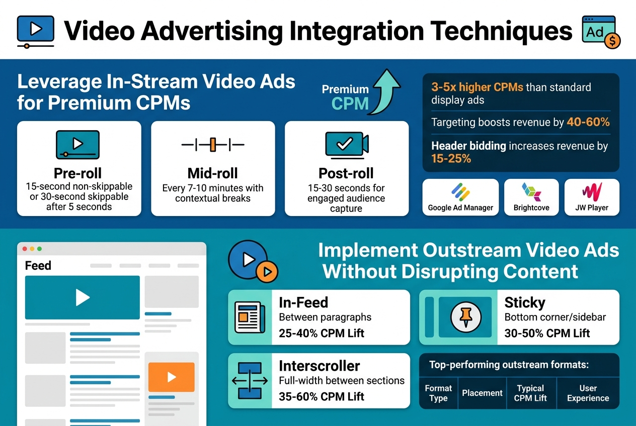
Leverage In-Stream Video Ads for Premium CPMs
In-stream video ads deliver some of the highest CPM rates in digital advertising, often commanding 3-5x more than standard display ads. These ads play before, during, or after your video content, creating a premium viewing experience that advertisers pay top dollar to access.
Pre-roll ads capture viewers when their attention is fully focused, making them incredibly valuable for brand messaging. Most successful implementations use 15-30 second pre-rolls with skip options after 5 seconds. This balance keeps viewers engaged while providing advertisers meaningful exposure time.
Mid-roll placements work best for longer content pieces, typically videos over 8 minutes. Strategic placement at natural break points maintains content flow while maximizing revenue. Post-roll ads catch viewers who’ve consumed your entire video, representing highly engaged audiences that command premium rates.
Optimal placement strategies include:
- Pre-roll: 15-second non-skippable or 30-second skippable after 5 seconds
- Mid-roll: Every 7-10 minutes with contextual breaks
- Post-roll: 15-30 seconds for engaged audience capture
Video ad networks like Google Ad Manager, Brightcove, and JW Player offer sophisticated targeting options that increase CPM rates. Geographic, demographic, and behavioral targeting can boost revenue by 40-60% compared to untargeted placements.
Header bidding for video ads creates real-time competition among demand sources, driving up bid prices. Publishers using video header bidding typically see 15-25% revenue increases compared to waterfall setups.
Implement Outstream Video Ads Without Disrupting Content
Outstream video ads play within your content feed or sidebar without requiring existing video content, opening monetization opportunities across text-heavy websites. These ads autoplay when 50% visible and pause when scrolled out of view, creating user-friendly experiences that don’t interrupt reading flow.
In-feed video placements blend seamlessly with article content, appearing as natural content breaks rather than intrusive interruptions. Best practices involve spacing these ads every 3-4 paragraphs with relevant, high-quality creative that matches your content tone.
Sticky video ads follow users as they scroll, maintaining visibility without blocking content. These units typically appear in bottom corners or side rails, delivering consistent impressions while preserving user experience. Proper implementation includes easy close buttons and sound-off defaults.
Top-performing outstream formats:
| Format Type | Placement | Typical CPM Lift | User Experience |
|---|---|---|---|
| In-Feed | Between paragraphs | 25-40% | Natural content flow |
| Sticky | Bottom corner/sidebar | 30-50% | Persistent visibility |
| Interscroller | Full-width between sections | 35-60% | Engaging transitions |
Smart loading prevents page speed issues by only initializing video ads when users approach the placement zone. This lazy loading technique maintains site performance while ensuring ads load quickly when needed.
Frequency capping limits how often users see outstream ads, preventing ad fatigue and maintaining engagement rates. Most successful implementations cap at 2-3 outstream ads per page visit with 24-hour frequency limits.
Cross-device optimization ensures outstream ads perform well on mobile, tablet, and desktop environments. Mobile-first design approaches work best since mobile users represent 60-70% of most website traffic.
Native Advertising Implementation Methods
Blend Sponsored Content Seamlessly with Editorial Content
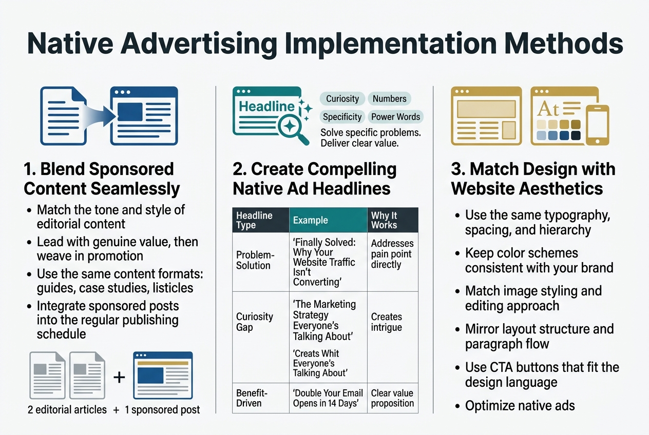
The art of native advertising lies in creating sponsored content that feels like a natural part of your website’s editorial flow. Readers should discover valuable information without feeling like they’re being sold to at every turn. Start by matching the tone and style of your regular content – if you typically write in a casual, conversational manner, your sponsored posts should follow suit.
Focus on providing genuine value first, promotion second. A fitness blog promoting protein powder works best when it’s wrapped in a comprehensive guide about post-workout nutrition rather than a direct product pitch. Your audience came for information, so deliver it while subtly weaving in your sponsored message.
Content format matters enormously. If your site typically features how-to guides, case studies, and listicles, your native ads should follow these same patterns. A sponsored post that looks like an obvious advertisement will stick out like a sore thumb and damage trust with your readers.
Timing and placement play crucial roles too. Integrate sponsored content during your regular publishing schedule rather than flooding your feed with promotional material. Mix one sponsored piece with two or three editorial articles to maintain balance.
Create Compelling Native Ad Headlines That Drive Engagement
Headlines make or break native advertising campaigns. Your sponsored content headlines need to spark curiosity while delivering on their promise, just like your best editorial content.
The most effective native ad headlines solve specific problems or answer burning questions your audience already has. “5 Budget Marketing Tactics That Actually Work” performs better than “Check Out Our Amazing Marketing Software” because it leads with value rather than self-promotion.
Numbers and specificity work wonders in native ad headlines. People love concrete promises – “Save 3 Hours Weekly” or “Cut Expenses by 30%” give readers clear expectations about what they’ll gain from clicking.
Question-based headlines tap into natural human curiosity. “Why Do Most Small Businesses Fail at Social Media?” draws readers in because they want to avoid making those same mistakes themselves.
Power words boost engagement rates significantly. Words like “secret,” “proven,” “exclusive,” “insider,” and “breakthrough” create urgency and exclusivity without sounding overly promotional.
| Headline Type | Example | Why It Works |
|---|---|---|
| Problem-Solution | “Finally Solved: Why Your Website Traffic Isn’t Converting” | Addresses pain point directly |
| Curiosity Gap | “The Marketing Strategy Everyone’s Talking About” | Creates intrigue |
| Benefit-Driven | “Double Your Email Opens in 14 Days” | Clear value proposition |
Match Native Ad Design with Website Aesthetics
Visual consistency builds trust and reduces banner blindness. Your native ads should feel like they belong on your website, not like foreign objects dropped in from somewhere else.
Typography alignment is your first priority. Use the same fonts, sizes, and spacing that appear in your regular content. If your editorial posts use a clean sans-serif font for headlines and readable serif for body text, your native ads should follow this exact pattern.
Color schemes must stay consistent across all content types. Sponsored posts that use different color palettes immediately signal “advertisement” to visitors. Stick with your brand colors and established design hierarchy.
Image styling needs careful attention. If your regular content features bright, high-contrast photos, don’t suddenly switch to muted, stock-photo-looking images for sponsored content. Maintain the same editing style, filters, and overall aesthetic approach.
Layout structure should mirror your editorial content format. Use the same paragraph spacing, image placement, and overall flow that readers expect from your site. This familiarity helps sponsored content feel native rather than intrusive.
Call-to-action buttons deserve special consideration. While they need to stand out enough to drive clicks, they shouldn’t clash dramatically with your site’s design language. Use your established button styles with perhaps slightly more prominent placement or color intensity.
Mobile optimization becomes even more critical with native advertising. Sponsored content that looks seamless on desktop but breaks your mobile design will immediately expose its promotional nature to mobile users, who make up the majority of web traffic.
Affiliate Marketing Revenue Optimization
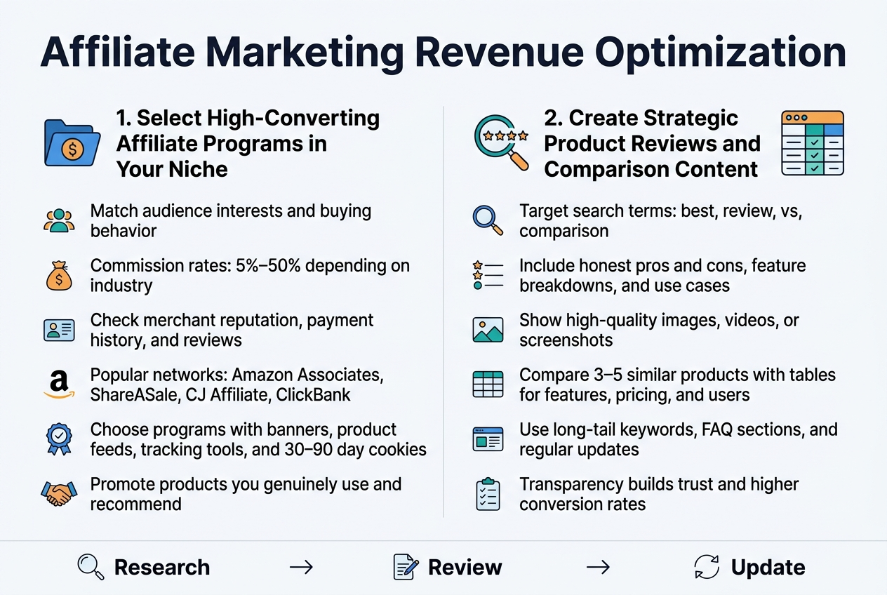
Select High-Converting Affiliate Programs in Your Niche
Finding profitable affiliate programs requires careful research and strategic thinking. Start by identifying programs that align closely with your audience’s interests and purchasing behaviors. Look for merchants offering commission rates between 5-50%, depending on your industry – digital products typically offer higher percentages while physical goods may provide lower but more consistent earnings.
Research the merchant’s reputation by checking their payment history, customer service quality, and brand credibility. Programs with established track records and positive reviews from other affiliates usually deliver better long-term results. Amazon Associates remains popular for beginners due to its vast product selection, though commission rates are relatively low. Consider specialized networks like ShareASale, CJ Affiliate, or ClickBank for higher-paying opportunities in specific niches.
Evaluate the promotional materials and support provided by each program. Quality merchants offer banners, product feeds, and tracking tools that make promotion easier. Cookie duration matters too – longer tracking periods (30-90 days) give you more opportunities to earn commissions from delayed purchases.
Focus on programs promoting products you’ve actually used or can genuinely recommend. Authenticity builds trust with your audience and leads to higher conversion rates than promoting random products for quick profits.
Create Strategic Product Reviews and Comparison Content
Product reviews and comparisons drive some of the highest affiliate conversion rates when done properly. Start by choosing products your audience actively searches for and considers purchasing. Use keyword research tools to identify review-focused search terms like “best,” “review,” “vs,” and “comparison” within your niche.
Structure reviews to address real buyer concerns and questions. Include honest pros and cons, detailed feature breakdowns, and practical use cases. Your audience values transparency – mentioning drawbacks actually increases credibility and trust. Include multiple high-quality images, videos, or screenshots showing the product in action.
Comparison content works exceptionally well for affiliate sales. Create detailed comparisons between 3-5 similar products, highlighting key differences in features, pricing, and target users. Use tables to present technical specifications and feature comparisons clearly. End each comparison with specific recommendations for different user types or budgets.
Optimize your review content for search engines by targeting long-tail keywords like “[product name] review” or “[product A] vs [product B].” Include relevant keywords naturally throughout your content while maintaining readability. Add FAQ sections addressing common questions about the products you’re reviewing.
Update your reviews regularly as products change or new alternatives emerge. Fresh, current content ranks better and provides more value to readers making purchasing decisions.
Advanced Monetization Through Premium Content Models
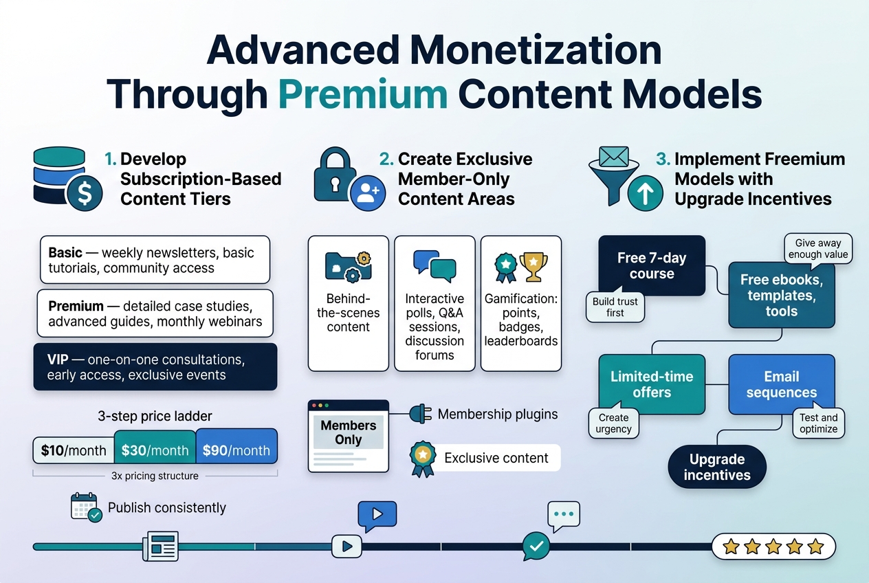
Develop Subscription-Based Content Tiers
Creating subscription tiers gives you recurring revenue while letting readers choose their level of engagement. Start with three tiers: basic, premium, and VIP. Your basic tier should offer valuable content that hooks readers without giving everything away. Think weekly newsletters, basic tutorials, or community access. Premium subscribers get deeper content like detailed case studies, advanced guides, or monthly webinars. VIP members receive everything plus one-on-one consultations, early access to new content, or exclusive events.
Price your tiers strategically. Research shows most successful sites use a 3x pricing structure – if basic costs $10/month, premium should be around $30, and VIP around $90. This psychological pricing makes the middle tier seem like the best value, driving most sign-ups there. Test different price points every quarter and adjust based on conversion rates and subscriber feedback.
Content calendars keep subscribers engaged. Plan exclusive content drops, member spotlights, and interactive sessions. Successful subscription sites publish consistently – whether that’s daily, weekly, or monthly doesn’t matter as much as being reliable. Your subscribers need to know what to expect and when to expect it.
Create Exclusive Member-Only Content Areas
Password-protected sections of your website create urgency and perceived value. Members feel special accessing content others can’t see. Build these areas using membership plugins like MemberPress or Restrict Content Pro for WordPress sites. The key is making the exclusive content genuinely better than your free offerings.
Behind-the-scenes content works incredibly well. Share your creative process, business insights, failed experiments, or personal stories. Readers love feeling like insiders getting the “real” story. Document your journey, share screenshots of your analytics, or record yourself working through problems. This raw, unfiltered content builds stronger connections than polished blog posts.
Interactive elements boost engagement in member areas. Create polls asking what content they want next, host monthly Q&A sessions, or start discussion forums where members can network. Some sites add gamification – points for commenting, badges for participation, or leaderboards for top contributors. These features turn passive readers into active community members who stick around longer.
Implement Freemium Models with Upgrade Incentives
Freemium models let people experience your value before paying. Give away enough free content to demonstrate your expertise, but hold back premium features that solve deeper problems. Email courses work perfectly for this – offer a free 7-day course that delivers real value, then pitch a comprehensive paid program at the end.
Content gates drive conversions when done right. Offer free ebooks, templates, or tools in exchange for email addresses. After people download, send them additional free resources over several weeks, building trust and showcasing your paid offerings. The key is patience – don’t pitch immediately. Provide value first, build relationships, then make relevant offers.
Limited-time offers create urgency for upgrades. Flash sales on annual subscriptions, bonus content for early adopters, or deadline-driven discounts push fence-sitters toward purchasing. Track which incentives work best for your audience. Some respond to discounts, others prefer bonus content, and some need social proof like “Join 10,000+ subscribers” messaging.
Email sequences automate your upgrade process. Set up a series that introduces new free users to your paid offerings over time. Include success stories, detailed explanations of premium features, and clear calls-to-action. Test different sequence lengths and messages to find what converts best for your specific audience and niche.
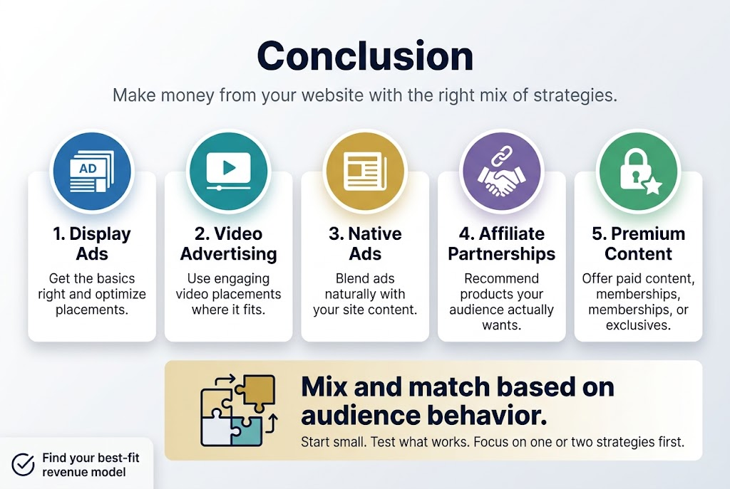
Making money from your website doesn’t have to feel like rocket science. The strategies we’ve covered – from getting the basics of display ads right to exploring video advertising, native ads, affiliate partnerships, and premium content models – give you a solid roadmap to boost your revenue. Each approach has its sweet spot, and the magic happens when you mix and match them based on what your audience actually wants and how they behave on your site.
Start small and test what works best for your specific situation. Maybe display ads are your bread and butter, or perhaps your readers respond better to carefully chosen affiliate products. Don’t try to implement everything at once – pick one or two strategies that feel like the best fit and get really good at them first. Your website’s earning potential is sitting right there waiting for you to unlock it.